The Challenge
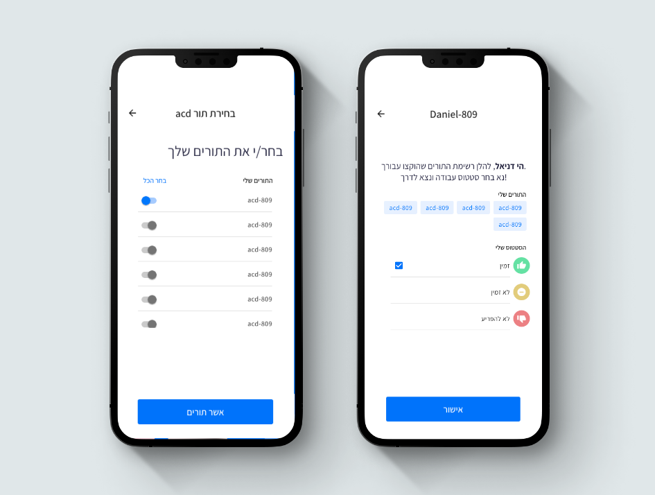
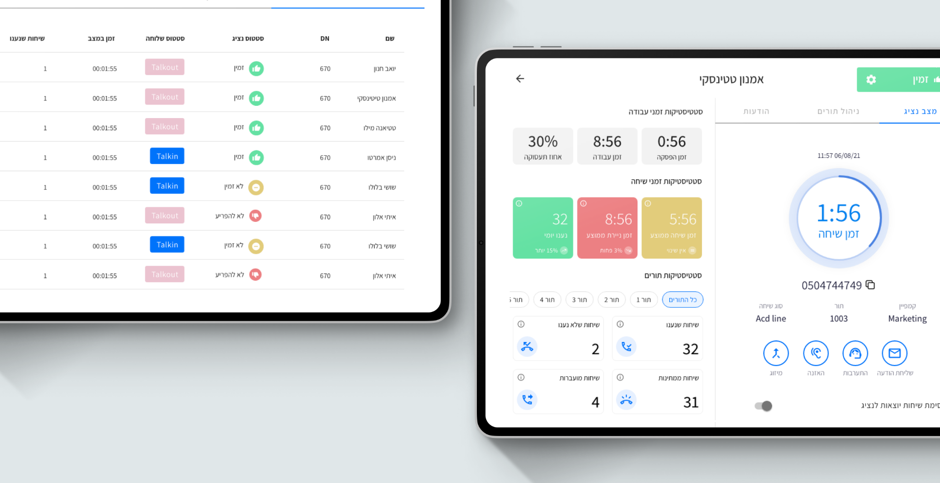
The old interface was outdated and difficult to use, but it also didn't speak to the modern user. The Calltech product was going through a transition from desktop to web interface, so they needed a company that could handle both sides: re-designing the interface while maintaining the integrity of the brand's core values.
What we did
The Concept
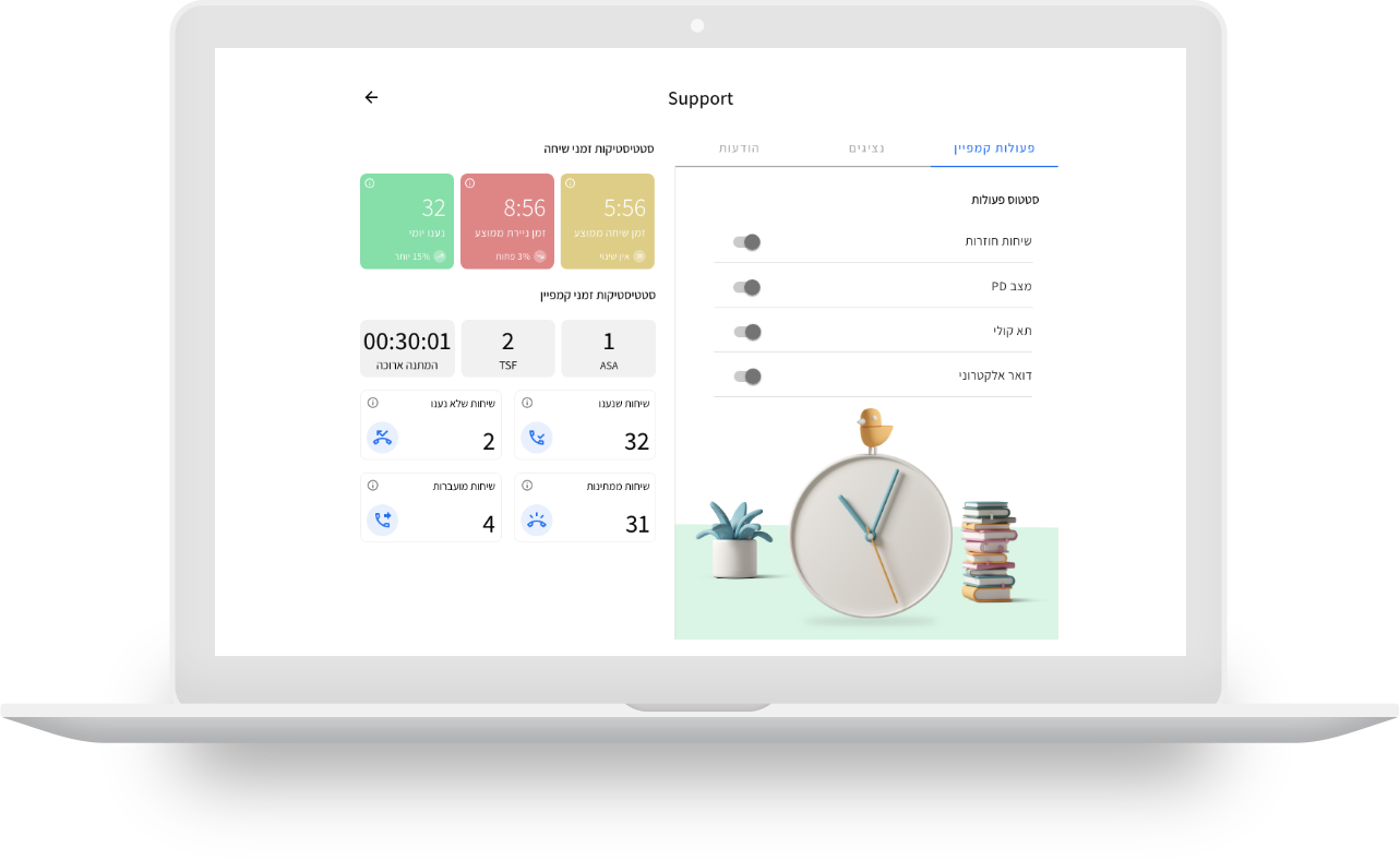
The USER Experience should be as easy and seamless for the user, so we highlight all important information that's been hidden. We also create minimize mood when the user is on a call so he can focus better! And by improving this simple change in design - it'll help us grow more customers faster than ever before
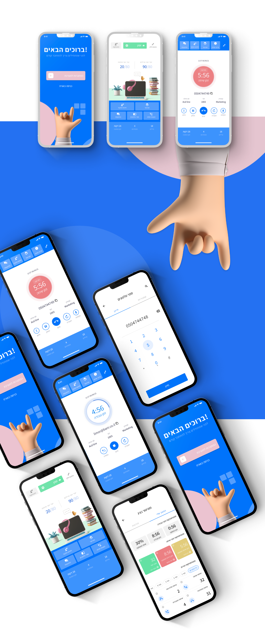
Within two months, the companies had developed a new platform that users loved working with and quickly adapted to using regularly.
We worked with Calltech to create a new design system and UX-UI, improve upon the user flow after deep interviews with their audiences, and implement those changes in an efficient timeline that didn't interfere with the day-to-day business of either company.
“I have been working with Outline for a couple of months now. They are one of the most creative and innovative agencies in the market. Their outstanding UX UI design paired with their outstanding customer service is why I love working with them. They are flexible, understanding, and always ready to take on new challenges.”
- Shlomi Cohen,VP R&D at Calltech -
