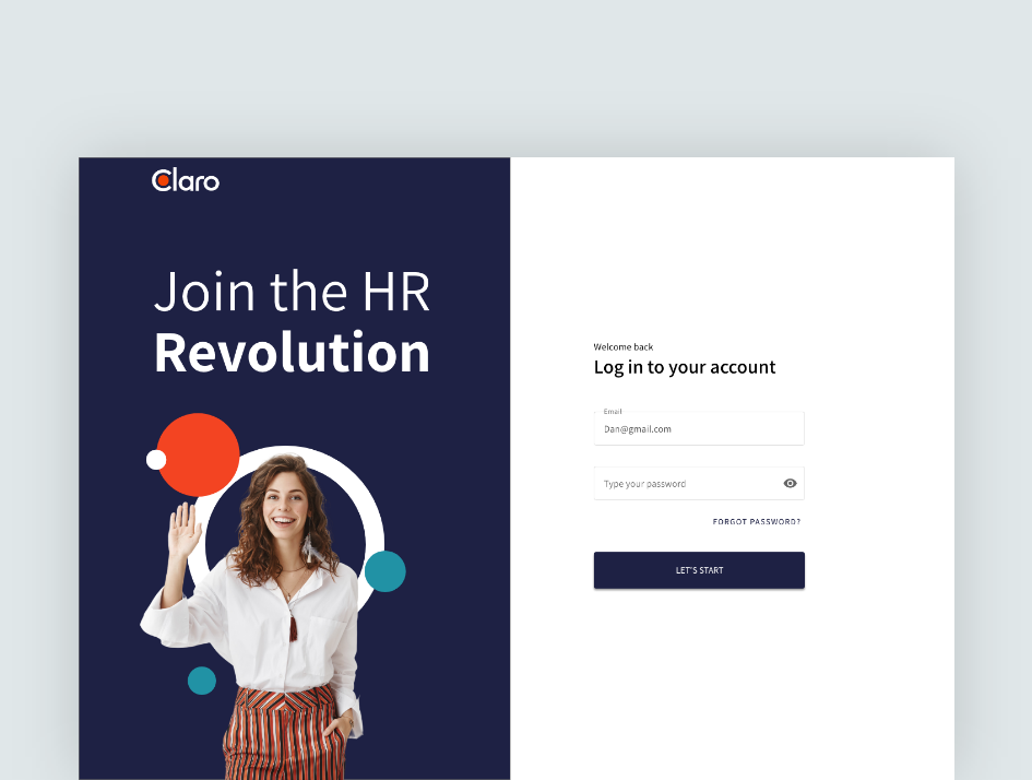
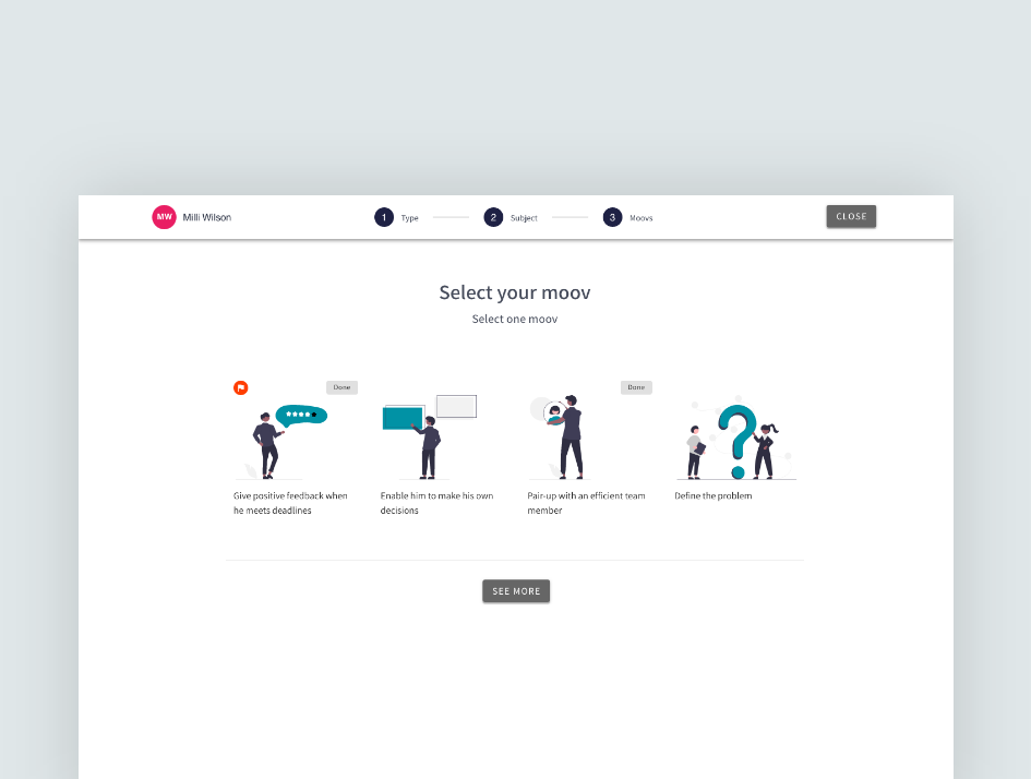
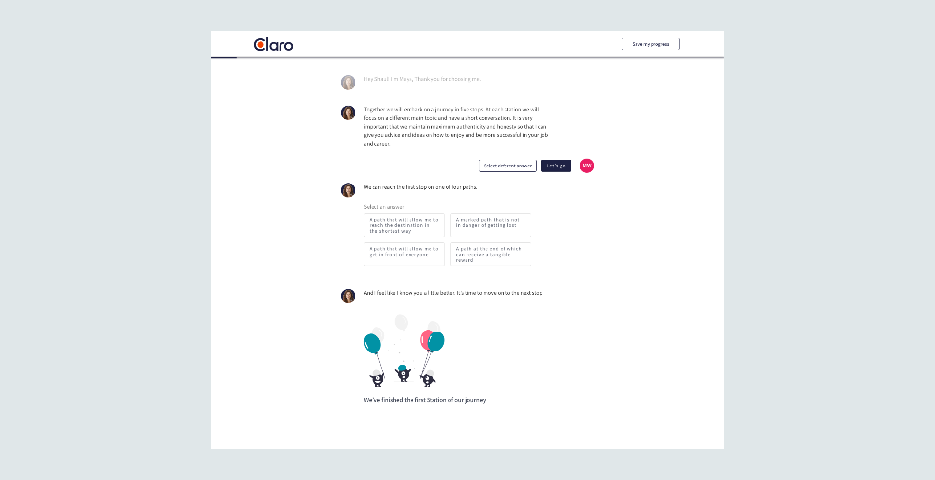
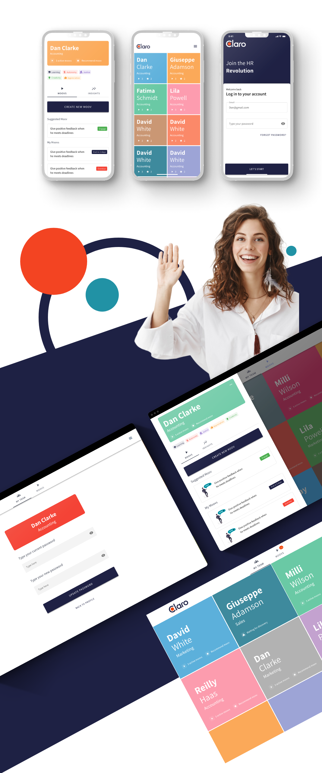
London, UK. One of our latest projects was to develop a new
responsive, multi-language website.
The Challenge
Bara nestled right into our wheelhouse. A dynamic co-working space attracting entrepreneurs, tinkerers, and creatives in the tech hub of Ann Arbor, Michigan, they wanted a lifestyle brand—a complete ecosystem of brand visuals and assets that could be worn, posted, shared, and nodded at by others in the know. The challenge was capturing their collaborative ethos by creating these individual touchpoints in a way that felt and behaved like a cohesive system. Part of that was designing and building a website to accommodate the virtual community, welcoming both new and established members with the same energy and agility as the physical spaces.
Our Approach
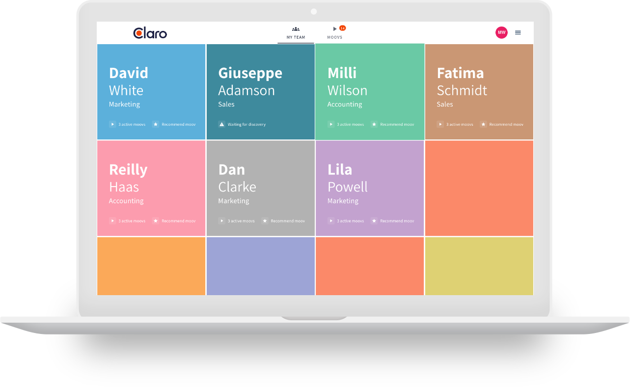
Our approach was to present the site as a visual editorial platform with quarterly features based on
events and occasions the brand was focused on. Each quarterly focus would be marked by the hero
and custom tags that filter content.
“The website and tools you’ve given
- Lucas Antony,CEO at Bara Co. -
us are killing it in lead generation, and our
AdWords click-through and conversion
rates are going great!”
